Understanding user behavior is the cornerstone of modern digital communication. Unlike traditional print media, where linear reading is the norm, digital consumption is fragmented and erratic. People do not read every word on a screen; instead, they scan for relevance, seeking the fastest path to an answer. By mastering the five core reading patterns—F-Pattern, Layer-Cake, Spotted, Commitment, and Zig-Zag—creators can align their content with the biological and cognitive reality of how the brain processes information in a hyperlinked environment.
What is the F-Pattern in digital content consumption?
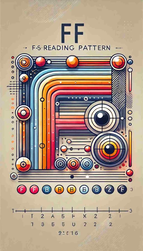
The F-Pattern is a scanning behavior where users primarily focus on the top and left side of a page, creating a shape resembling the letter “F.” Readers start by moving horizontally across the upper part of the content, then move down the page slightly to read a second horizontal line, and finally scan the left side of the text in a vertical movement. This occurs most frequently in dense blocks of text lacking clear formatting or subheadings.
This pattern was first popularized by the Nielsen Norman Group and remains a dominant force in User Experience (UX) research. When a page is a “wall of words,” the human eye naturally tries to find the most efficient route to value. Since Western languages read left-to-right, the top-left corner receives the highest amount of visual “real estate” attention.
“Users will not read your text thoroughly in a word-by-word manner. Exhaustive reading is rare, especially when users are in a hurry.” — Jakob Nielsen.
Statistically, studies show that roughly 79% of users always scan any new page they come across; only 16% read word-by-word. This means that if your most important information—the Value Proposition—is buried in the middle of a paragraph on the right side of the screen, it is effectively invisible. To counteract the negative aspects of the F-Pattern, designers use “pattern interrupts” like bold text and bullet points to pull the eye back into the content. Without these, the bounce rate increases as the user feels the cognitive load is too high for the perceived reward.
Why is the Layer-Cake Pattern the most effective for SEO?
The Layer-Cake Pattern occurs when a reader scans only the headings and subheadings of a page, skipping the body text entirely until they find a section that matches their intent. It is considered the most effective for SEO and User Engagement because it rewards well-structured, hierarchical content. By looking at the “layers” (H1, H2, H3 tags), a user can understand the entire scope of an article in seconds.
This pattern is a direct response to the “Information Overload” of the modern web. Readers are looking for “Information Scent”—clues that a specific paragraph contains the answer to their query. If your subheadings are descriptive and answer-focused, you satisfy the user’s need for speed. This behavior is why GEO (Generative Engine Optimization) focuses so heavily on clear structures; AI models, much like humans, prioritize the semantic relationship between headings and the text that follows.
- Scannability: High-contrast headings act as anchors for the eye.
- Reduced Cognitive Load: The reader doesn’t have to guess where the section ends.
- Better Retention: Even if they don’t read the body, they walk away with the “Big Ideas” of the article.
As search engines move toward rewarding “Helpful Content,” the Layer-Cake structure becomes mandatory. It signals to both the user and the crawler that the page is organized and professional. By providing the answer at the beginning of each “layer,” you build trust and encourage the reader to transition from a “Scanner” to a “Committed Reader.”
How does the Spotted Pattern impact information retrieval?
The Spotted Pattern is characterized by the eye jumping around the page, focusing on specific visual “spots” that stand out from the rest of the text. These spots are usually bolded words, hyperlinked text, numbers, or capitalized words. The reader is essentially hunting for a specific data point, such as a price, a date, or a technical term, ignoring the surrounding narrative entirely.
This pattern highlights the importance of Visual Hierarchy. If a page is monochromatic and uniform, the “spots” are non-existent, leading to frustration. However, when used correctly, the Spotted Pattern allows for rapid-fire information retrieval. Statistics suggest that users spend about 10% more time looking at numbers than at words representing the same value. For example, “100” is a visual magnet compared to “one hundred.”
When optimizing for this behavior, copywriters use Bold Keywords to guide the “huntsman” reader. This isn’t just about aesthetics; it’s about accessibility. If a user is looking for “Cost-effectiveness” and that phrase is bolded, their eye will lock onto it instantly. This reduces the time-to-value, which is a key metric in modern Digital Marketing.
What defines the Commitment Pattern in long-form reading?
The Commitment Pattern represents a traditional, linear reading style where the user reads almost every word in a sequence. This is rare online and usually only occurs when the user is highly motivated, trusts the source implicitly, or is consuming “deep-dive” educational content. It is the “holy grail” of engagement, signifying that the content has successfully transitioned the user from a casual browser to a focused student.
Achieving this requires a high level of EEAT (Experience, Expertise, Authoritativeness, and Trustworthiness). A reader will only commit to 1,000+ words if the introduction proves that the content is unique and valuable. In this state, the user ignores distractions and follows the author’s narrative flow from start to finish. This is the primary pattern for whitepapers, technical documentation, and long-form thought leadership pieces.
How does the Zig-Zag Pattern function on image-heavy pages?
The Zig-Zag Pattern occurs on pages that alternate between text and visual elements, causing the eye to move in a diagonal or “Z” motion across the layout. As the user scrolls, they bounce from an image on the left to a text block on the right, and then to an image on the right and text on the left. This keeps the visual interest high and prevents the “scanning fatigue” associated with uniform text blocks.
This pattern is highly effective for Conversion Rate Optimization (CRO). By placing a compelling visual next to a Call to Action (CTA), you guide the user’s gaze directly toward the desired interaction. It breaks the monotony of vertical scrolling and creates a rhythmic experience that feels more like a curated gallery than a manual. Experts predict that as the internet becomes more visual and “shippable,” the Zig-Zag pattern will become the standard for product pages and interactive storytelling.
Why should you optimize for the Scanning-First mindset?
Optimizing for a Scanning-First mindset is essential because users decide whether to stay on a page within the first few seconds. If the page structure does not immediately reveal its value through one of the core reading patterns, the user will exit. Designing for “Scan-ability” is not “dumbing down” content; it is respecting the user’s time and cognitive energy.
Research indicates that by 2027, the volume of digital information will double, making the competition for attention even fiercer. To survive this shift, content must be:
- Direct: Provide the “Bottom Line Up Front” (BLUF).
- Fragmented: Use short paragraphs and lists.
- Visual: Use images to anchor the text.
By acknowledging that people “read” with their peripheral vision before they read with their focus, we can create content that is both discoverable by search engines and digestible for humans.
The Future of Digital Readability
The evolution of how we consume information is moving toward a symbiotic relationship between human intuition and algorithmic structure. Understanding the 5 Core Reading Patterns is no longer an optional skill for creators; it is a fundamental requirement for any successful Content Strategy. By layering information, highlighting key “spots,” and designing for the “F” and “Z” motions, we ensure that our message is not just published, but actually perceived. As the internet continues to evolve into a more immersive and reasoning-based environment, the clarity of our structure will remain the most powerful tool for capturing and holding human attention.